Grainger
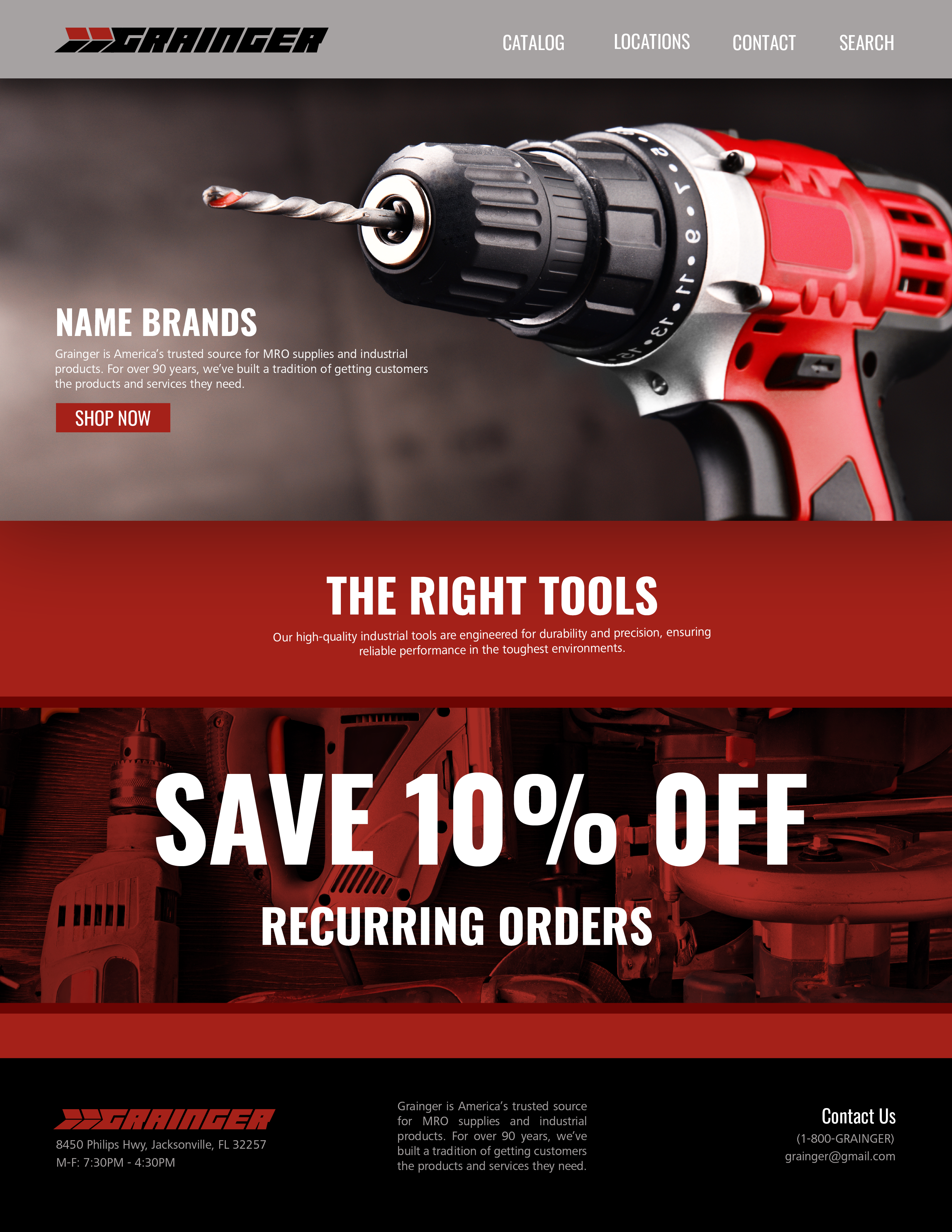
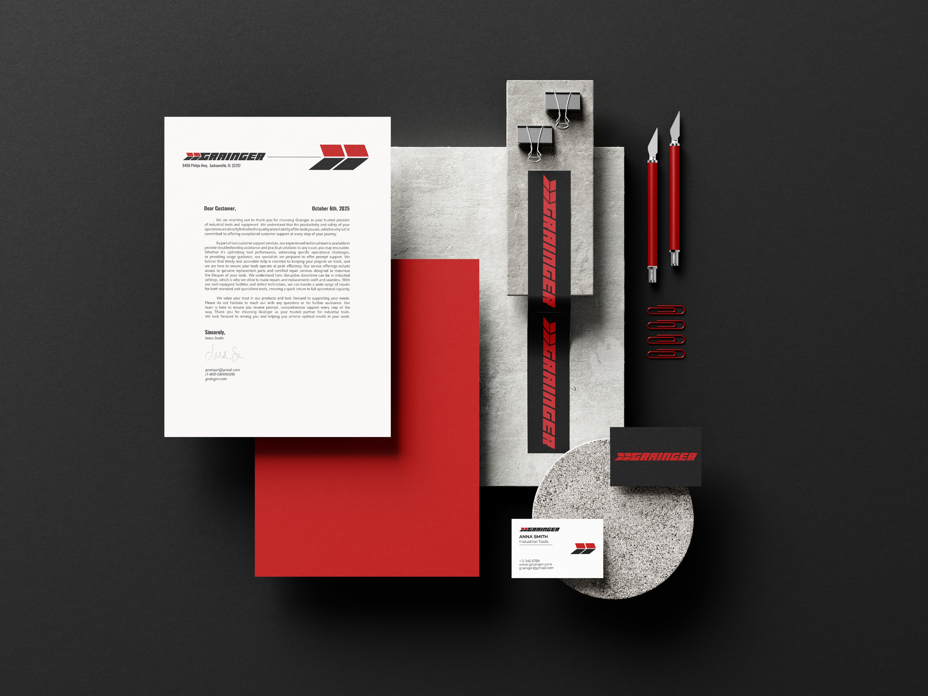
Branding, Stationery, and Web Interface

Grainger
Branding, Stationery, and Web Interface
Design Challenge- This brand renovation for Grainger, a leading industrial and safety supply company, emphasizes their commitment to providing fast, reliable solutions for their B2B partners. The revamp highlights the crucial role of stability and efficiency in customer relationships. Their goal is to deliver a customer experience where products are dependable, arrive on time, and serve as the cornerstone of every construction project, ensuring safe and consistent satisfaction.
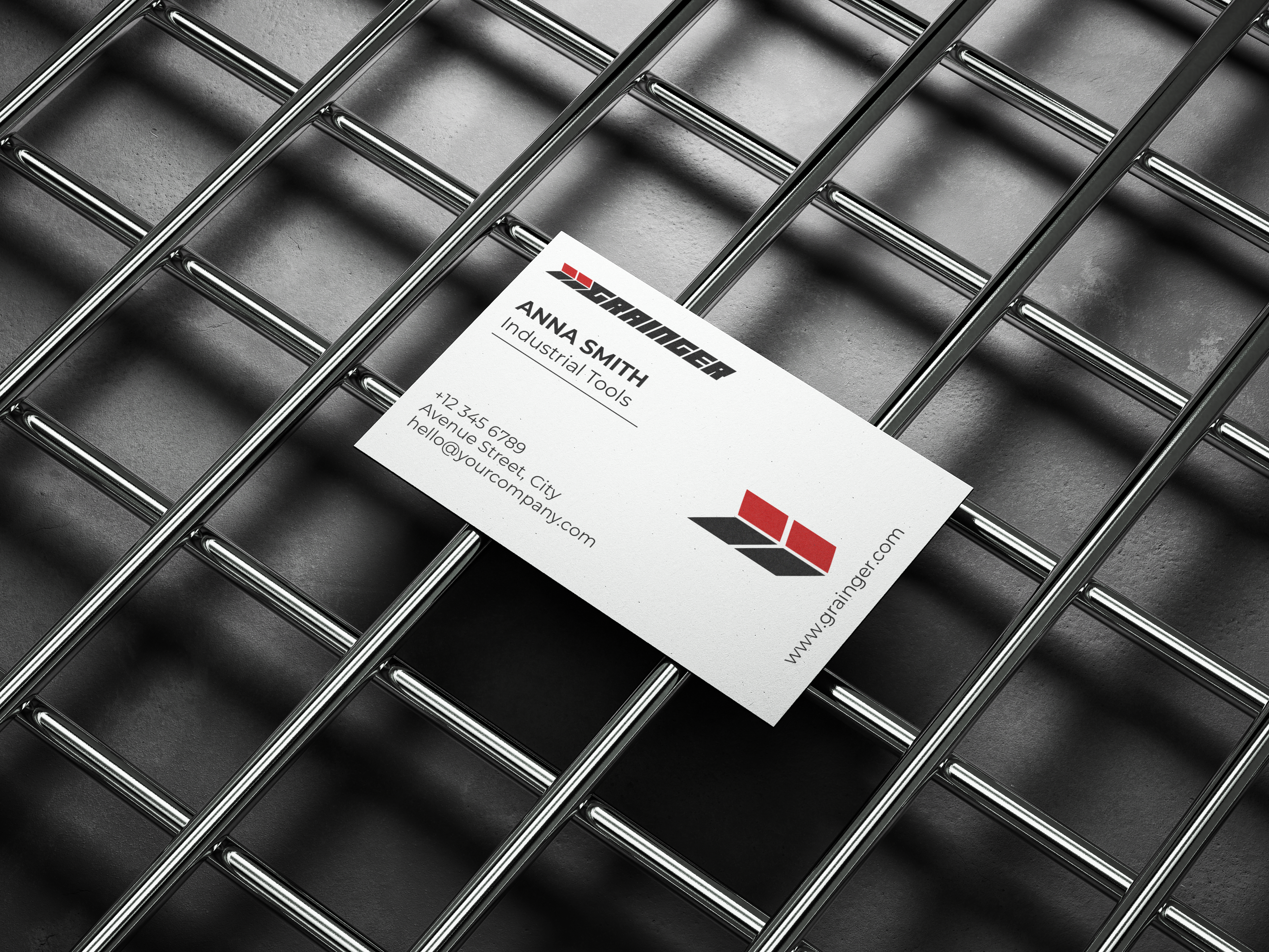
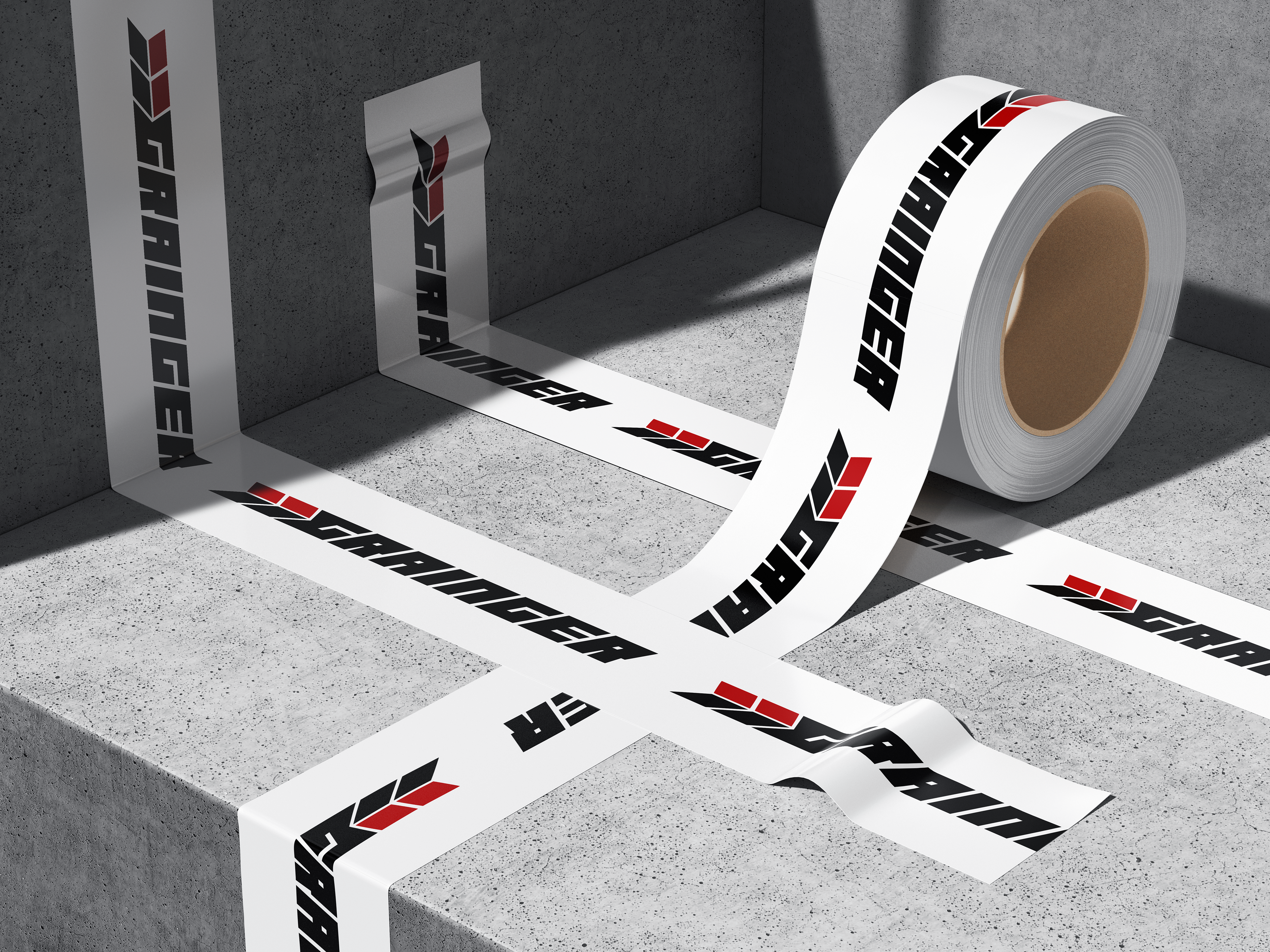
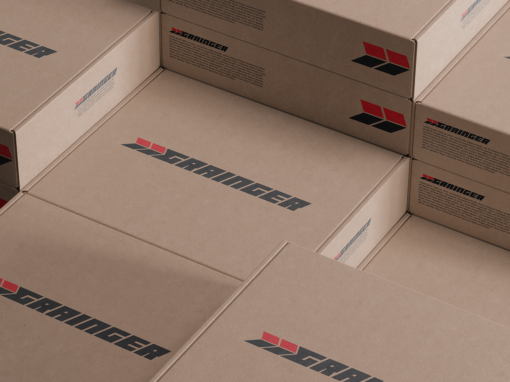
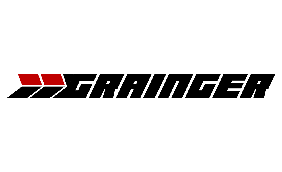
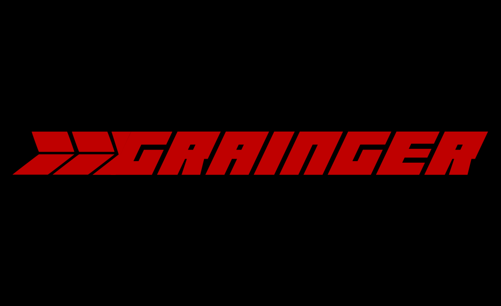
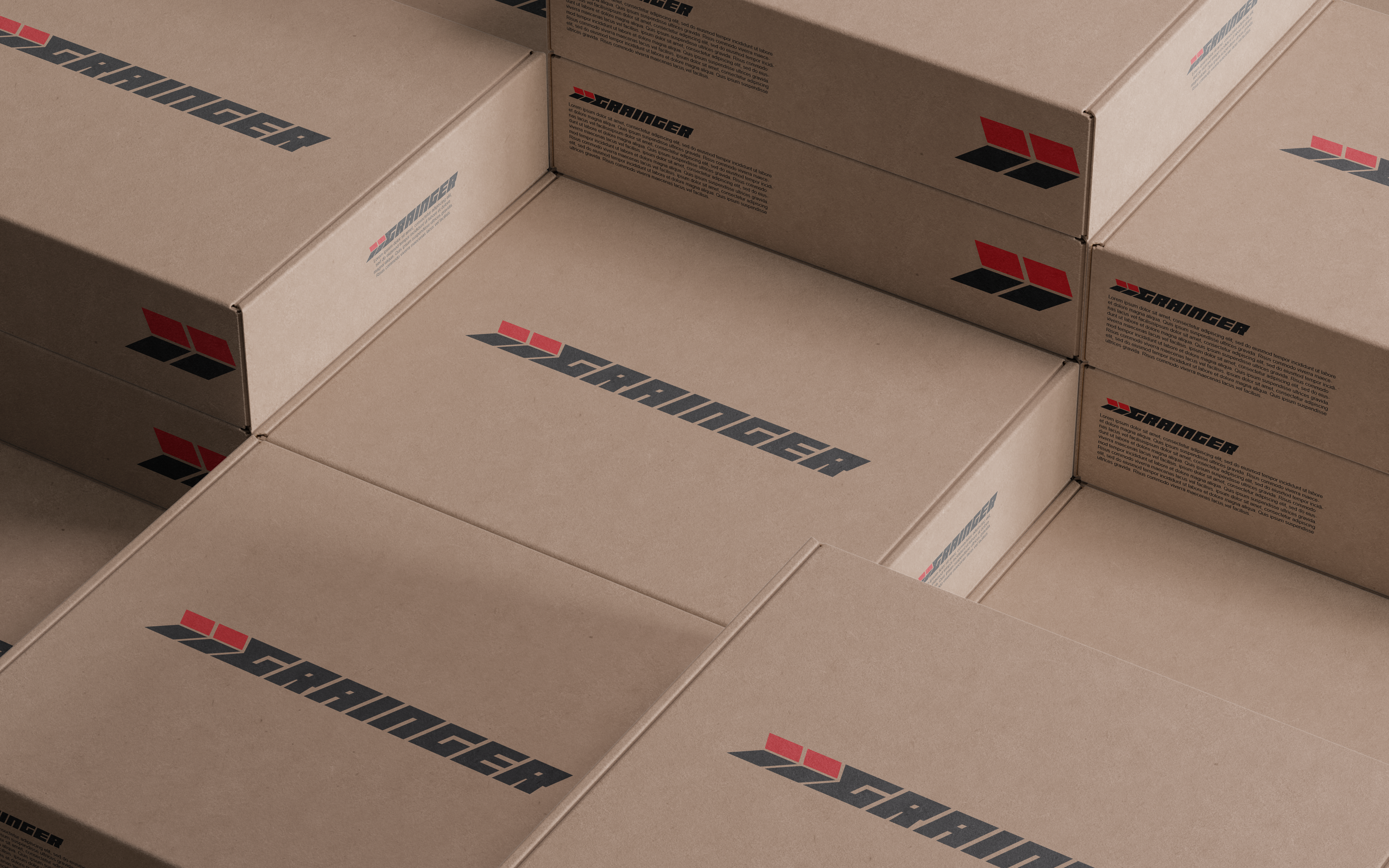
Design Solution- The color palette draws inspiration from the hero archetype, positioning the brand to boldly stand out against competitors who favor more royal and regal tones. The bold, blocky typography symbolizes the strength and stability of the brand and its products, while the subtle italicization conveys the brand’s speed and urgency in delivery. This is reinforced by the use of two thick arrows, which further emphasize the brand’s foundation of reliability and efficiency.
